
Today we are going to talk about the analysis of stock data. Stock data is a specific sort of time series data. And it is special in that we observe the current price of a stock share. It is like units in stock, or the bank account balance… It always has the (overall) value, not the change (which as analysts we still have to calculate) or other similar meaning.
We have to be careful not to use the default aggregation function (sum), because doing so would show wrong results. Therefore, either we use the last available value (last non blank), or we approximate with an average. (Both can be right depending on the type of analysis.)
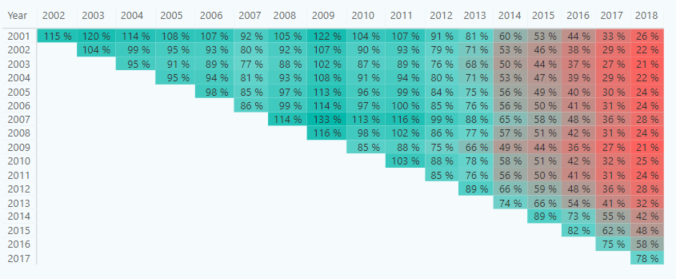
In this example the data is about the stock share of the Microsoft Company. And the analysis will be to see which year this stock was a good buy with the comparison of the sold stock year. Hence, we will get a matrix… or half of it…
Something right about this…
How do we do that, you ask?
Well, let me explain.
For one, the data model is not that complex. You just create two Date dimensions (Date Bought and Date Sold).
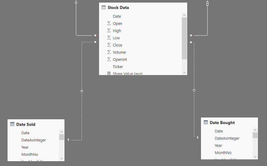
Furthermore, you just have to create/prepare a calculation for the return on investment (ROI %).
ROI % =
IF (
MIN ( ‘Date Bought'[Date] ) < MIN ( ‘Date Sold'[Date] )
&& NOT ISBLANK ( [Price Bought] )
&& NOT ISBLANK ( [Price Sold] );
DIVIDE ( [Price Bought]; [Price Sold] )
)
So… the min bought day has to be before sold date, logically (and hence half the matrix). And secondly, we just calculate the growth or drop in the share price. And what I get is what was shown before, a matrix which I format to make it visually easier to understand.
What we can deduct from the visual is that it almost always a great time to buy this stock in any of txhe observed years (2002-2018) if we would be selling it in the last couple of years (2014-2018). The percentage values is calculated as return on investment – under a 100% percent we would be loosing money, over 100% is how much we would get if selling at that particular year based on the invested amount.
(Years in the first column would be the Buy Year and years in the first row the Sold Year)
Normalizing Time
For some easier overview of the data (if you will give something like the calculation/visual as before to a client – he will definitely be as happy as one can get by having insight into his data) we are going to normalize time as the time from starting the investment trough the years passed.
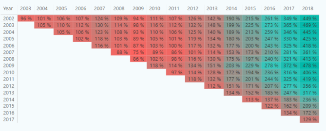
Getting a matrix in this way:
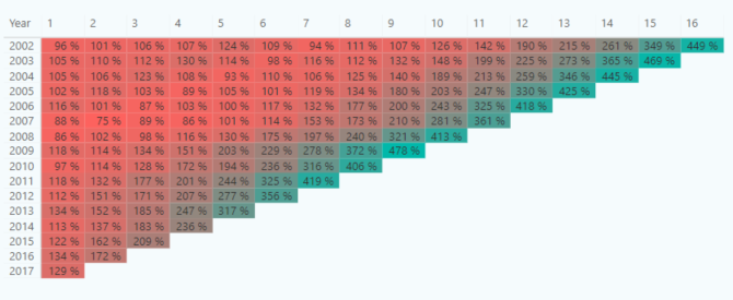
The percentages of investment drop or growth must be the same, however the matrix is left “aligned”.
To get the above result, there are two things we need:
- A Period helper table
- A new DAX calculation
The first one is quite easy to insert in Power BI. Just go under the ‘Modeling’ tab and insert a ‘What-if’ parameter.
The new DAX calculation might need a bit more knowledge of DAX, but no worries, we are going to explain it. What we need is a similar calculation to the aforementioned ROI, this time a ROI relative calculation. The mathematical formula is the same, but we need to incorporate the relative number of ‘Relative years’ instead of the ‘Sold Year’.
And, we do this by creating a new calculation ‘Price Sold Relative’. First, we check if only one value of the relative year is active (no totals), and calculate the price sold based on how many years have passed after the investment was done – Price Bought.
The calculation goes:
Price Sold Relative =
IF (
HASONEVALUE ( Period[Period] );
CALCULATE (
[Price Sold];
FILTER (
‘Date Sold’;
‘Date Sold'[Year]
= VALUES ( ‘Date Bought'[Year] ) + [Period Value]
)
)
)
The second calculation we have to create or change is the ROI relative calculation. Again, the mathematical formula is the same, however the calculation must be valid for Relative years also.
And the calculation goes:
ROI % Relative =
IF (
AND (
AND ( HASONEVALUE ( Period[Period] ); [Price Sold Relative] > 0 );
[Price Bought] > 0
);
DIVIDE ( [Price Sold Relative]; [Price Bought] )
)
Putting everything together with some additional dashboard tuning goes into this.

You can see the app here.

Leave a comment